
Sandip Ray Breaks Cinematic Clichés With New Kolkata Film Festival Logo
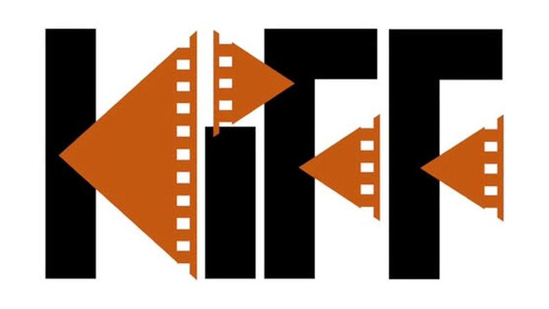
As Creative Bloq reports, the Kolkata International Film Festival has unveiled a distinctive new logo designed by filmmaker Sandip Ray. Moving away from generic industry symbols, the design utilizes geometric film-strip elements to create a bold, angular identity for the event's 32nd edition, which is scheduled to take place in West Bengal from December 16 to 23.
Context from Industry Pulse
The debut of this logo comes at a time when the design industry is increasingly concerned with the homogenization of visual styles. According to reporting from Creative Bloq, there is a growing weariness toward perfectly formed sans-serif fonts and the rise of AI tools that tend to output averaged, safe aesthetics. The Kolkata International Film Festival branding represents a pivot toward idiosyncratic, handmade design. By focusing on the 32nd edition's specific cultural heritage in West Bengal and leveraging the legacy of the Ray family, the festival avoids the generic pitfalls often found in global arts branding. This shift highlights a desire for original, angular work that resists the sterile trends of current digital design.
The visual identity for the upcoming Kolkata International Film Festival departs from the common industry practice of combining disparate cinematic icons like cameras and clapperboards. According to Creative Bloq, the new branding relies on a single cohesive concept rather than a collage of tropes. The design features heavy black lettering intersected by burnt-orange triangles, which are detailed with sprocket holes to mimic physical film strips.
Sandip Ray, the creator of the mark, is a filmmaker and the son of the renowned director and designer Satyajit Ray. This familial connection to high-level graphic design is reflected in the logo's disciplined execution. Rather than using the film strips as a decorative border or secondary element, Ray integrated them into the foundation of the typography itself. This structural approach transforms a potentially dated motif into a modern graphic asset.
The resulting aesthetic is described by Creative Bloq as chunky and unconventional, offering a stark contrast to the minimalist sans-serif styles that currently dominate modern branding. By avoiding the polished, predictable look favored by many contemporary design tools, the festival has secured an identity that prioritizes recognizability and character. The orange triangles within the letters have also been noted for their resemblance to play and rewind symbols, adding a subtle functional layer to the visual.
Industry observers suggest that the success of the logo lies in its commitment to a singular, bold idea. While many film festivals struggle to create an impact with their visual marketing, this edition of the Kolkata event utilizes just two colors and sharp angles to stand out. It serves as a reminder that even traditional imagery can feel original when it is treated as a core design component rather than an after-thought or piece of clip art.
The Industry Pulse Bottom Line
The Kolkata International Film Festival logo proves that even overused industry symbols can be revitalized through structural integration, offering a compelling alternative to the current trend of safe, AI-influenced minimalism.