
Standardized AI Lettering Sparks Controversy and Comparisons to Comic Sans
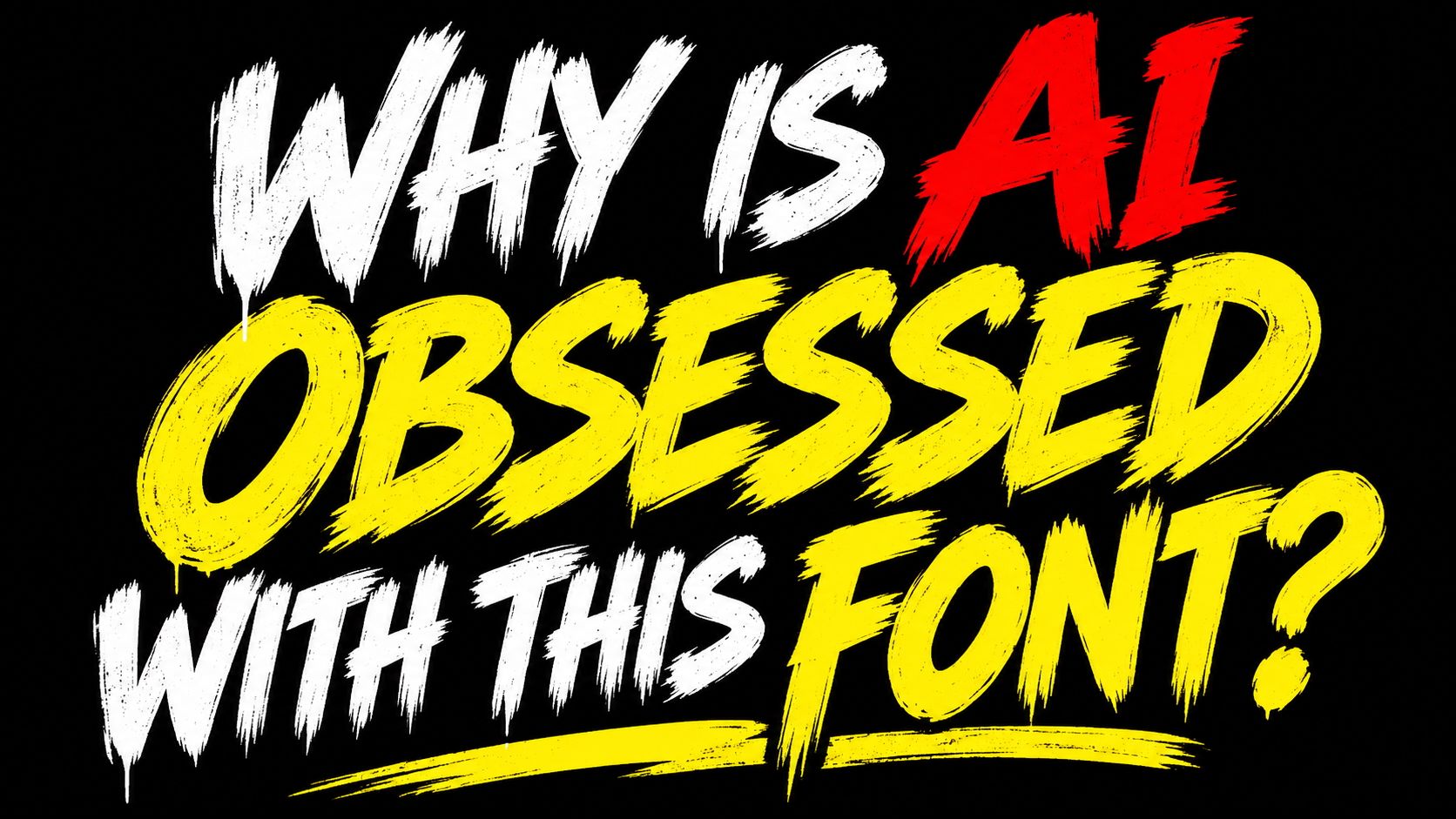
Creative Bloq reports on a growing design backlash against a specific aggressive brushstroke font frequently produced by AI image generators. As small businesses increasingly rely on automated tools for local advertising, the ubiquity of this slanted, shouty lettering has led critics to compare its negative reputation to the infamous Comic Sans.
Context from Industry Pulse
The rise of AI-generated typography reflects a broader shift in creative practice where efficiency often supersedes original design intent. While institutions like Pratt adapt their curricula to these technological changes, the physical world is seeing the immediate impact through standardized marketing materials. The controversy surrounding this new AI font mirrors historical debates over Comic Sans, which was misunderstood despite being designed for specific informal contexts. However, the current trend differs because it relies on algorithmic repetition of popular design clichés rather than human purpose. This highlights a growing tension between the convenience of automated companionship tools or design generators and the desire for authentic, handmade expression in contemporary communication.
"AI image generators frequently use this bold, brushstroke-style lettering because they've learned to associate it with exciting, attention-grabbing design."
Small businesses are increasingly turning to artificial intelligence for marketing materials like cafe posters and local event flyers. According to Creative Bloq, these automated tools often default to a specific aesthetic characterized by aggressive brush strokes, distressed textures, and a slight upward slant. While these designs are intended to be attention-grabbing, their frequency has made them a telltale sign of AI-generated content in physical spaces.
This trend is largely driven by accessibility and cost. Creative Bloq notes that organizations with limited resources often prioritize the speed and ease of AI over hiring professional designers. For users who are not deeply immersed in digital design trends, the repetitive nature of these visuals may go unnoticed, even as the style becomes saturated across various public environments.
Comparisons have emerged between this modern AI lettering and Comic Sans, though experts suggest the two serve different roles. As reported by Creative Bloq, Comic Sans was originally designed to solve a specific communication need by mimicking informal cartoon speech. Despite its polarizing reputation, it was ranked as the second most trusted font globally in 2020, whereas the new AI style is criticized for appearing unmistakably artificial despite its handmade aspirations.
Industry experts attribute this repetitive output to the way AI models are trained. Creative Bloq explains that these generators associate oversized capitals and bright colors with high-impact design because those patterns are prevalent in the advertisements and social media thumbnails found in their training data. Rather than selecting a distinct typeface, the technology generates lettering that mimics popular visual clichés.
Ultimately, what was meant to look rebellious and expressive now serves as a marker of automation. Creative Bloq highlights that the overuse of these specific visual patterns is causing a shift in perception, where formerly artisanal-looking typography is now viewed as a generic byproduct of algorithmic production.
The Industry Pulse Bottom Line
The ubiquity of AI-generated brushstroke lettering demonstrates how algorithmic training on popular design clichés can inadvertently create a new symbol of low-effort branding, potentially surpassing the notoriety of Comic Sans.